
Skip to case study
Evelyna Bellamy
Auto · Daylight
Time of day

Following your local clock · Daylight

Warm ivory · charcoal · open sky

Local time, no location access. Choose a stop to keep that atmosphere.

A material atlas

Chromologium

Making design systems felt.

Design / Research / Engineering

An independent archive translating physical, cultural, and historical knowledge of making into digital design. Color is the entrance; the larger subject is how an interface acquires a coherent character.

Color lives
between systems
and people.

Pigment
Light
Material
Interface
Human

A more
sensory
commons

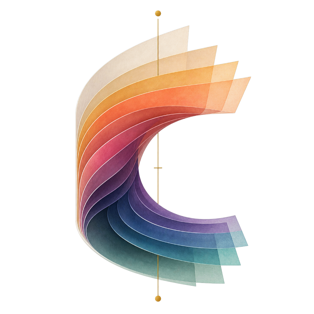
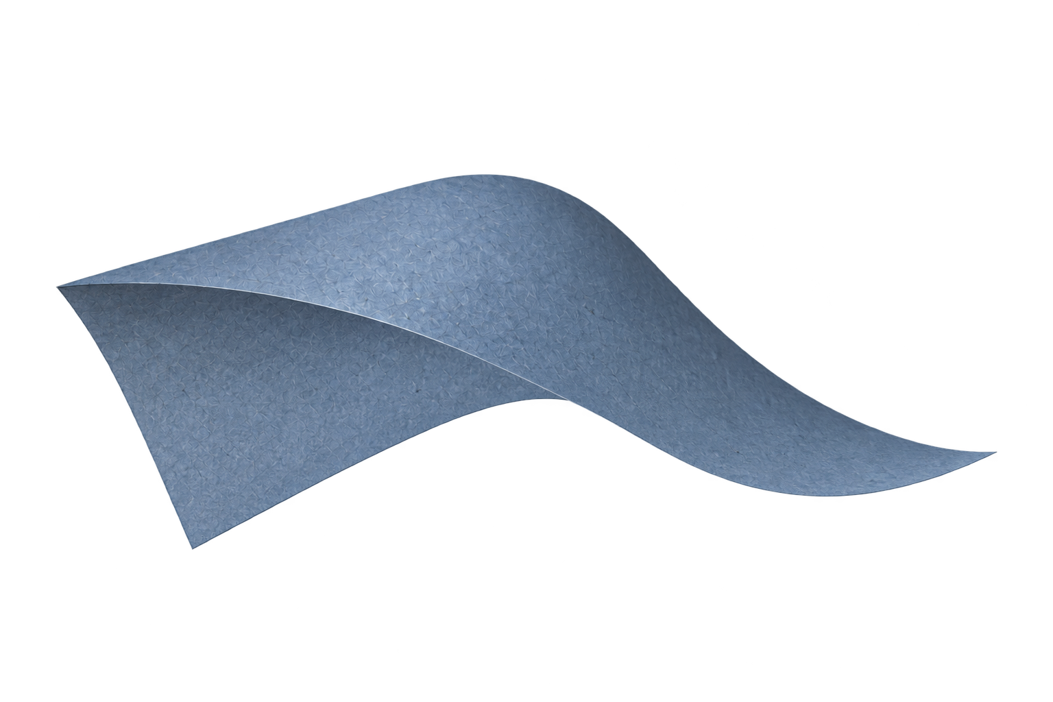
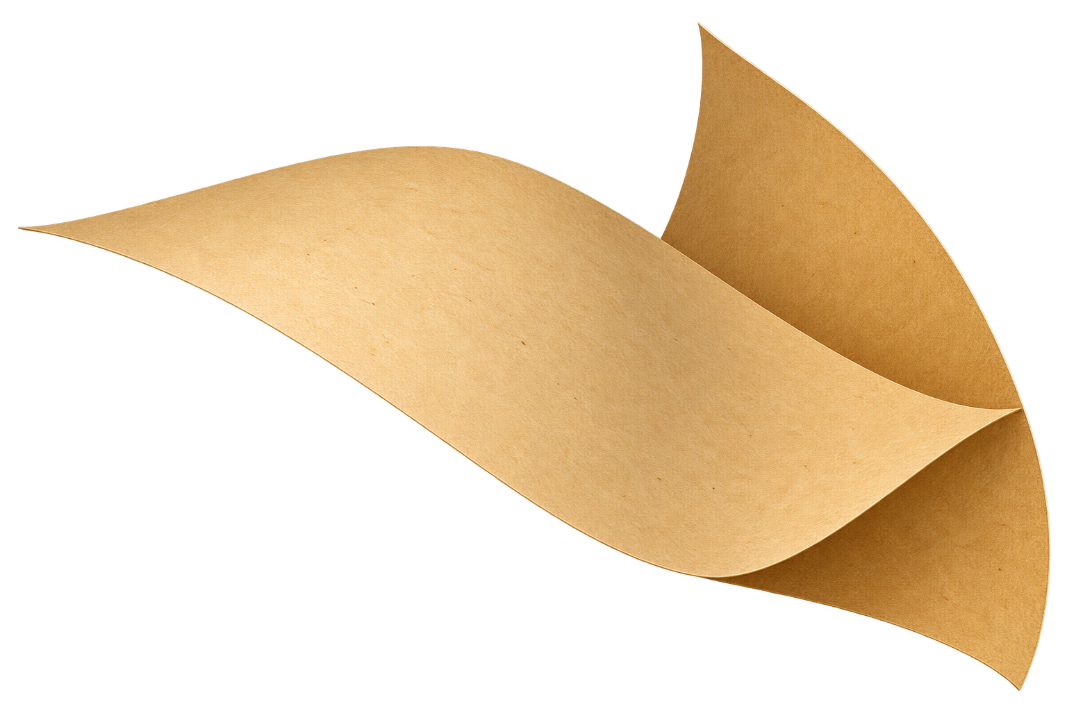
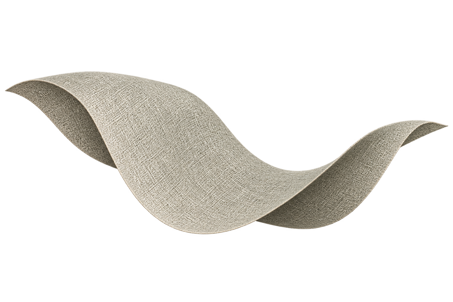
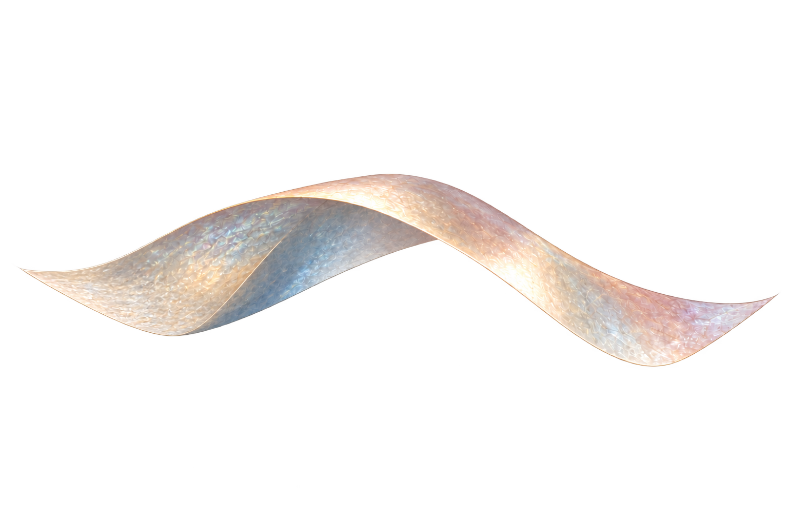
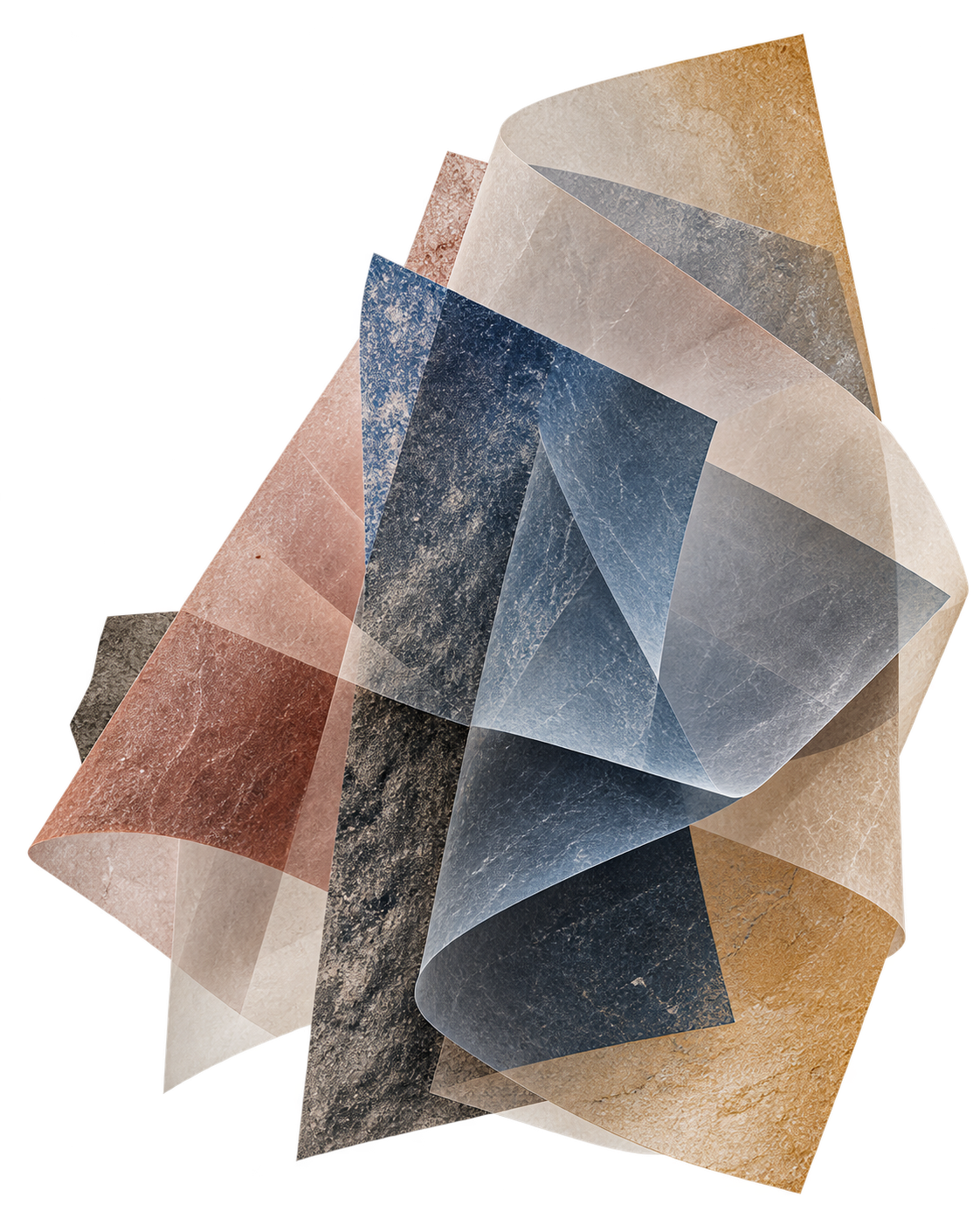
Eight illustrated materials. Choose a sheet to explore its palette, surface and origin.

Illustrations · art-directed motion, not physical simulation.

01 / The question

What gets lost between a design system and the experience of using it?

Tokens describe individual choices. A visual system also depends on the relationships between typography, light, surface, motion, and interaction. Chromologium makes those relationships available for inspection through working studies rather than a palette alone.

This working edition describes the project’s current structure and design questions. It does not claim measured user or business outcomes.

02 / A working study

One interface. Different languages.

Illustrative / interactive

An original explanatory specimen for this case study—not a screenshot or reproduction of the live archive’s systems.

ChromologiumLibrary · Journal · Study

Color
shapes
what we
notice.

A design system for
a more human spectrum.
A closer look →
Hues
Materials
Combinations
Contexts
Field notes
A / Classic

A considered, editorial voice.

ChromologiumLibrary · Journal · Study

Color
shapes
what we
notice.

A design system for
a more human spectrum.

A closer look →
Hues
Materials
Combinations
Contexts
Field notes
B / Modern

A restrained, contemporary system.

ChromologiumLibrary · Journal · Study

Color
shapes
what we
notice.

A design system for
a more human spectrum.

A closer look →
Hues
Materials
Combinations
Contexts
Field notes
C / Material

A softer, tactile composition.

Reading the difference / Editorial

Serif typography, generous margins, and a warm paper surface make this version feel like a publication. The material sits beside the words, not behind them.

03 / Design rationale

Precision.
And feeling.

The choices an interface makes visible.

01

Material, not decoration.

The archive treats physical materials as a source of interface principles. The challenge is to preserve their character without making reading and navigation depend on visual effects.

02

Compare the whole system.

A useful comparison holds the task steady while typography, spacing, and surface change together. That makes coherence easier to inspect than isolated swatches.

04 / Inspect the work

From the project itself.

Tools & methodology / external links

Behind the work

The workshop stays open.

Earlier compositions, material experiments and the arrangement editor live in a separate lab. Explore the process without losing the thread of the case study.

Explore the material lab